Environment

Untitled-1This is a picture of the bridge that is out by Higgins point. I wanted to have a picture that had a bunch of picture together like this. I like the way that those pictures end up looking and it also shows that I put some more creativity into the picture that just taking one straight shot of the bridge. I had to darken all the pictures so that they would all match up with the color brightness. I like the way this picture ended up looking but I wish I would have paid more attention to the gap that is in the middle of the picture. That is the only thing that I would like to change about this picture. Other than that, I really like the way this turned out. HERE is my link of inspiration for this picture. Now I know that it isn’t what my picture is but I couldn’t think of what this is called so I was unable to look up any pictures that were like mine.

_MG_6906

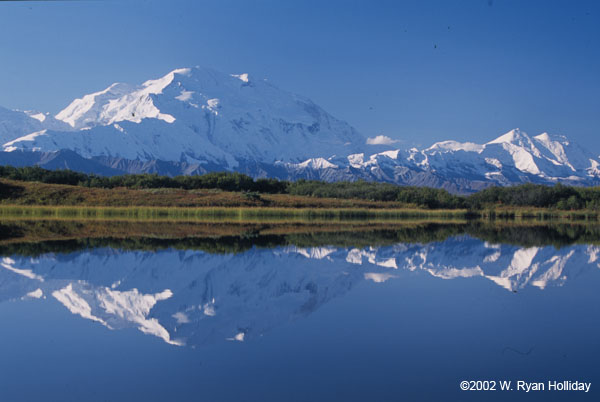
I like this picture because of the reflections. I like how the wood pole has a reflection and the mountain does as well. It also shows the rule of thirds. I changes the white balance so that it would be a bit brighter. HERE is my link of inspiration. It’s the same idea because of the reflection and the mountain. Mines different because Im not showing the mountain, just the wooden pole. I like the way this picture ended up looking.

_MG_6914

I like the way this picture ended up looking. I like how The branch that is running through the middle of the picture is more in focus that the other branches and I like the depth of field in this picture. I also like the colors in this picture. HERE is my link of inspiration for this picture. It’s very similar to my picture because of the depth of field. The only thing that is different is the dragon fly on the branch.

_MG_6915

I like this picture more than the one above because i like how all the branches are in the background and it adds more lines to the picture. In my opinion this is a more interesting picture that the one above. The link of inspiration is the same as the one above. It has the same idea as the one above.

_MG_6922

I like this picture because I actually like how grey it looks it the background. It add kind of a sad look to the picture with all the leaves drooping down and all falling off. I also like how mostly all the activity in this picture is on the right side of the picture and how the left side of the picture is all grey. I really like the sad and gloomy look to this picture and how it ended up looking.

_MG_6930

I like this picture because you can see the snowy mountains in the background. I like how the beaches change colors as well. I wish the sky would have been more blue and bright out so that the day would look more pretty and exciting. I also wish it would be blue because it would of made the picture look more energetic and happy. But other than that I like the way this picture ended up looking.

_MG_6931

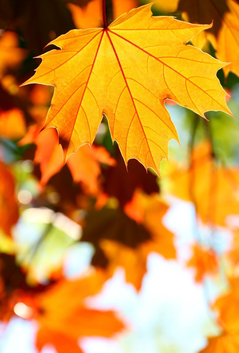
I like this picture because it looks a lot happier than the ones above. The colors are brighter and more energetic. I like the depth of field in this picture. It not all blurry and out of focus. You can still tell what is in the back ground of the picture. I also like how the branches of the tree come up in the picture. I like the way it looks because they all go out in a bowl shape direction in a way. Those really aren’t the right word for the shape but I don’t know another way to say it.

_MG_6909

I really like the way this picture ended up looking. I like how a lot of the side walk shows in the picture and how a lot of the water is showing as well. I really like the colors of this picture. When I look at this picture I think of cold. The grey made it look sad again but I really like the way it looks in the picture. One thing I wish would be different about this picture is having someone or maybe a couple sitting on the bench. That would have added more emotion and feeling to the picture.

_MG_6921I like this picture because I like the way the water ended up looking. I wish I would have showed more water and have a lot less of the rocks and stuff in the picture. Other than that I like the way this picture ended up looking. I like how the water shows the rocks through the water in the beginning and then it gets darker as it get farther away.

_MG_6911This is supposed to be my movement picture. I was trying to get the bird flying to look like it was moving and all blurred. Or I was trying the get the bird all in focus and everything around it all blurred. I wasn’t able to accomplish this because I was too far away form the bird and my lens on my camera doesn’t zoom in that much. HERE is what I was trying to do. I should have grabbed my dads other lens and tried doing this picture but I didn’t even think about that before I  left the house.

My Favorites

I realized that when I picked out these pictures that they are all very similar because they are all in macro mode or a close up. I guess that shows what I really like to take picture of. I like to show detail in things and not just show the big picture of it. I really enjoy these pictures and I hope that you do as well:)!

mg_5204This is my all time favorite picture that I have ever taken. I love all the colors and how sharp and in focus it looks. I really like the bubbles on the picture because it adds more to the picture than just taking a picture of some fruit. I added a little bit more creativity to the picture with the bubbles. To get the bubbles I just put the fruit in a vase and filled the vase with tonic water. I then put a blue folder in the background so that the entire picture would have some bright colors with it. I took this photo maybe a year ago and I have loved it ever since then. I even have a picture of it hanging it my room:). This is my favorite photo shoot i have ever done as well. I really enjoyed taking those pictures. HERE is my link for this picture. This picture isn’t the same idea put it is similar. I actually have pictures like the link but they are not my all time favorite pictures.

mg_5133This picture is the same idea as the one above and it is also one of my favorite pictures. I really like the lemon is see through and that the bubbles are sharp and in focus as well. I had the same setup as the picture above with the vase, tonic water, and blue folder. I really like how you can see all the lines in the lemon. I really like how much detail you can see in this picture. HERE is my link of inspiration for this picture. That link is very similar to my picture. The only difference is that it is an orange and not a lemon.

untitled-51This is a picture of a part of a guitar. I don’t know what the part is called, the adjustment knobs maybe? But anyway, I really like the depth of field in this picture. The hexagons in the back are my favorite part of this picture. They aren’t lights, they are more of the adjustment knobs, but they made a blue color because of the lights reflecting off of them. I also really like how in focus the main knob is. This is just a really nice picture in my opinion and I took my time with this picture. I really wanted it to make it look nice. HERE is my link of inspiration for this picture. Its not the exact same thing as my picture but it is defiantly similar.

mg_6822I really like this picture because it is only showing half of lamp. I tried to get the entire lamp in it but the light was too bright and over exposed the picture so I had to stick with taking only half of the lamp. But I’m glad it worked out that way because I really like the way it ended up looking. I really like all of the colors in this picture and I also like that the background is all black. It doesn’t have any distraction in the picture. I also like how the focus is on the light bulb and nothing else. I also like how soft the colors look on the reflection on the lampshade. HERE is my link of inspiration. It’s from a different angle but it is very similar to my picture.

purpleI really like this picture as well. I like all the water droplets on the leaves. I like the fact that you know what the weather has been like. I also really like the fact the the leaves are purple. I mean when do you ever see purple leaves? I didn’t change the color to purple either, the leaves are actually that color. I like the detail on the leaf and I also like the depth of field. I also like how the leaves aren’t all the same shade of purple. that leaf in the background is more of a fuchsia and I really like  how it is. HERE is my link of inspiration for this picture. That link is actually very similar to my picture. They are a lot a like.

Christmas Break

_MG_6850This is a picture of a bird feeder that is in my backyard. I like this picture because it is simple and not much to it and it also shows the season of the year. I like how sharp the snow looks near the bottom of the bird feeder. I also like how much the bird feeder stands out with the color. Everything else in the picture is either brown or white and the bird feeder is colorful compared to everything else. I also really like the depth of field in this picture. I didn’t have to do much editing in the picture either. This is just how the picture ended up looking and I am proud of myself for getting the picture to turn out this well.

_MG_6845

This isn’t my favorite picture ever but I still like it. I imagined this picture looking different when I was taking it but it didn’t turn out the way I wanted it to. I do like how the birdhouse is darker than everything else in the picture. I also like all the lines that are in this picture.

_MG_6857

I like the way this picture ended up looking because the mountain looks really cool in my opinion. I also like how vibrant and colorful the barn looks. I wish that it wasn’t all foggy in the sky but I still like the way this ended up looking. It a nice and simple picture.

_MG_6870

This is another very simple picture. Now that I look at this picture more on the blog, it looks like I could have brightened the exposure, but other than that I like this picture. I like how it looks like there is a backdrop behind the picture because the snow is so white. I like how much detail there is on the rock as well.

_MG_6846 I like this picture because it kind of looks like its a spring time and also a winter picture. The colors of the plant remind me of spring or summertime but then there is snow on the plant. I like how the focus is on that one leaf in the bottom left corner of the picture and not on the entire plant. I like the way this picture ended up looking.

_MG_6866I like how the ice in this picture is see through in a way. I like how you can see more of the tree behind it. I also like the colors and the focus of this picture. I also like the angle that I took this picture at.

_MG_6859

I changed the color of the tree in this picture so that it would look more blue and cold. It defiantly gives you the impression that it is cold and that it is winter time. I like the depth of field in this picture as well.

Thanksgiving Break

For this weeks blog it was thanksgiving! I didn’t take any picture of the meal or what we were doing because my house was extremely crowded and there was absolutely no time to take pictures of what every one was up to. I was busy cooking away! So for this week I just took random pictures of things that were around the house, with all the decorations and little things.

_MG_6809I took a picture of some lights that are decorated inside of the house. I used the macro mode idea that you showed us in class. I wanted to try that idea out a little bit more. I was trying to make the light in focus but like you have said before, try different things and see how it turns out. I actually really liked the way this picture turned out, but that’s probably because I have always like the pictures with the lights all blurry and big looking. I wish that the blue light was more rounded in the picture, but other than that I really like this picture. I did change the contrast in the picture so that the blacks would be darker and a true black. I should have put an object in front of the lights so that the lights would be blurry in the back ground. Like THIS. I should have tried to put an object in front and made that in focus and then the lights be blurry like in that link picture. But HERE is my link of inspiration for this picture. that picture is exactly like mine except for the fact that there are more lights and that my background is actually black.

_MG_6813

I like the angle of this photo. I just went outside and saw the lights and started taking pictures and I ended up with this picture. I like how the lights on the top of the picture are in focus and the rest are blurry. I really like the way this picture ended up looking. I also changed the contrast and exposure to this picture so that the blacks would be darker. The only thing that I wish was different about this picture is to have stars in the sky. I should have waited longer so that there would be stars in the sky. I think that would add an interesting look to the picture.

_MG_6822_MG_6823_MG_6825

For the three pictures above, I couldn’t decide which one I liked more so I just decided to put them all on my blog! I like the idea of this picture because I like how the lightbulb is in focus and the rest of the picture is blurry. Like all my other pictures, I also changed the contrast so that the blacks would be blacker and so the things in the background wouldn’t be distracting, and by changing the contrast, they ended up disappearing. In the very first lightbulb picture, I like that one a lot because I like how I cut the lightbulb and only put the left half of the lampshade and lightbulb in the picture. I really like the way that picture looks. The next two pictures are very similar but the angle and how close I got to the lightbulb are slightly different. I tried to get the entire lightbulb in the picture, but that wasn’t working because the light was too bright and messed up the way I wanted the picture to look. That is why only parts of the lightbulb are showing. Now that I looked at all three of those pictures more, I think that my favorite one is the very first one. I just really like the angle of the picture. It’s very simple but looks interesting.

Surrealism

final eyes

Here is my link of inspiration for this picture. It’s not the exact same thing but it has the same idea to it. I actually kind of like the way it ended up turning out. It’s more of a creepy picture to me. It something that I have never done before so I decided to something a little bit different for this blog post. The ears look kind of gross because her hair is still on parts of the ears so it looks like she has really hairy ears but I guess that just adds to the creepiness.:)

_MG_6752Now here is the same picture but in the first one I forgot about the shadow of the ear on the shadow of the arm, so I fixed that and put a shadow on the shadow. It doesn’t look all the great but it does look more natural and looks like it is supposed to be there.

Screen Shot 2013-11-21 at 9.12.08 AMThese are two of the pictures that I used for my next picture. I also used a plain background of the left one, without the girl in the picture. I just decided to not add the picture to the screen shot. But the reason I had to have a background picture of the left picture s because then it would make it easier to take her head off.

Screen Shot 2013-11-22 at 8.47.53 AMThis is how far I have gotten on my photo so far. I took a picture of the background so that the door would be able to be seen in the background. Now the challenge I have now is making the sweatshirt hood look good and look like her head is actually not there.

Screen Shot 2013-11-22 at 9.10.23 AMAnd this is my final product. I tried to make it so the hood was actually in the picture but I was unable to get it to work, so I decided to just cut the hood off and make it more of a jacket with the strings still attached. I should have cut off the stuff and masked them out or something but I ended up not doing that. Im not very good with the clone stamp tool and blended it to make it look like nothing was ever there. That is one area that I need to improve on with photoshop work. But I still think this picture ended up looking really good. I thought that it wasn’t going to look really bad and that I wasn’t going to be able to do it but I was able to, and that makes me happy about it. When I was searching and trying to find my link of inspiration with this picture, I was unable to find it. The picture where I got my inspiration was just like this but with the color of the shirt noticeable and it looked really good.

The Coeur d’ Alene Colors

_MG_6747I really like the colors in this picture. It definitely shows that it is fall. The one thing about this picture is that the focus is more on the purple leaf o the left side of the picture. When I took the picture I didn’t notice that. It looked like the focus was on the yellow leaf. I still like this picture but I could have made it look better. I like how the stems in front of the yellow leaf are completely out of focus and fuzzy. I like the look that it gives the picture.

_MG_6750This picture has the same ideas as the picture above with the branch in the front all blurry and then the leaves are in focus. I like all the colors in this picture as well. I like the purple leaves in the background and on the ground underneath the yellow and green leaves. I like this picture because it shows more of the transition into fall because not all the leaves have changed to yellow yet. Here is my link of inspiration for this picture. It is the same idea because they are the same type of leaves and the colors are somewhat the same.

_MG_6748I like this picture because the leaves are still changing colors. They are completely done changing. The colors in the picture are nice as well. I like how purple everything is in this picture. I like the depth of field in this picture. I think this picture looks really nice. _MG_6746I really like the way this picture ended up looking. I like the depth of field and I like how these are the pretty much the only leaves left on the branch. I really like the colors of this picture. It adds a kind of warmth to the picture. When I look at it I think of warm weather even though fall is a colder season. I like how the focus is on the leaf in the very back. The three leaves in front of it are still in focus but just not as much. Here is my link of inspiration for this picture. This picture is very similar to mine because only that one leaf is in focus and these are the only leaves that are in focus and there is a small depth of field. 

Fall is in the Air (Free Choice)

_MG_6707This was one of the first pictures I took. I was going to crop the car out of this shot because in this particular shot I staying in the car to take it. But I ended up keeping it because I like the way it looked better than when I cropped it out of the picture. I like this picture because it shows that it is fall perfectly because the tree had none of its leaves on it which means that the leaves fell from it already. I also like all the colors in this picture.

_MG_6716I really like this picture because of the colors. I changed the colors in this so that they would pop out more. I like the way it ended up looking. It also shows so transition to fall because some of the trees have turned yellow I love the fall atmosphere because everything is always so pretty and colorful.

_MG_6725I also really like this picture. It’s just nice and simple. This particular picture doesn’t really have all the color changes on the trees but it does have all the pine needles on the side of the road that are red and I like that part of the picture. I also changes the colors in the picture so that they would pop out more. I love this area of Hayden. I love driving around this lake because it is always so pretty, no matter what season it is.

_MG_6720I really like the colors and the angle of the trees in this picture. I also changed the blue in the sky to pop out more. The reason I think this picture looks so good is because blue and yellow are contrasting colors and I didn’t even mean to take this picture for that reason. I just noticed that just now. But I do really like this picture. It really shows that fall is in the air. HERE is my link for this picture. It is somewhat similar just because of the yellow and the blue. Other than that its a completely different picture.

_MG_6718I really like this picture because there are more colors than just yellow and blue. There is the red tree on the left side of the picture. I guess this could be a rule of third picture but I think the red tree would have to be to the side more. I also changes the colors in this picture to pop out.

Idioms

Your’e the Apple to my Eyeapple to my eyeThis is my first idiom picture. I took a picture of an apple and someones eye and I photoshopped the eye onto the apple. It really wasn’t that hard to do. I thought it was going to be more difficult than it ended up being. I blended the skin of the eye to look like the same color as the apple and I think that worked really well. Here is my link of inspiration. This is a much better picture than mine but it is where I got my ideas from. It helped me make it look like the eye was actually on the apple. To see the picture that I am talking about, you have to scroll down to the very bottom of the link.

You Hold the World in the Palms of your Hands

world in the palm of your handsThis is my second idiom picture. This one didn’t work out as well as the one above. I couldn’t figure out how to make it look like the world was actually in her hands. I tried to use the paint brush tool and put black around the world so there would be more of a shadow but it wasn’t working out the way I wanted it to. Here is my link of inspiration for this picture. If you look at the link, the world has black around it and it looks like it is actually in the person hands. That is what I was trying to do, but it just wasn’t working the way that I wanted it to. I don’t really like this picture because you can defiantly tell it is photoshop. Well you would know it was photoshop even if I made it look better, but I could have made it look a lot nicer than this. I was just having a really difficult time with this for some reason.

Light Box

_MG_6673This was the set up for my project this week. This is the light box that I made out of a cardboard box, and white paper. I just cut holes in the side of the box and filled the inside of the box with white paper so that the background for my pictures would be one solid color. I used lamps that are in my house for the lighting in my pictures. I know that it is a mess around the box but that didn’t matter because that would not be showing in any of my final pictures. _MG_6682This is a picture of a shell that I fond in Huntington Beach, California. I really like this shell so I decided to take a picture of it. This isn’t my best picture form this project, but that is why I am putting it first so that I can show my improvement in the project. For some reason my camera was having a hard time focusing so i changed it to manual focus and it still wouldn’t focus it all the way and I didn’t know how to fix it so that is why this picture is blurry. The white balance in this picture isn’t really all the good. I tried to use the white balance tool and it changed it to this. I did try to change the exposure and everything to make the background actually look white, but it was way too bright and made it look worse. _MG_6677This is a medal I got for having good grades. I decided to take a picture of it because it is something simple and it fit in the box nicely. The metal on the outside looks shiny because the lights were I guess to harsh for this object but I do think that this is still a good picture. Again the wording on the medal looks blurry because my camera was having a hard time focusing. I did try to back away form the object more but it still wasn’t working the way I needed it to. _MG_6680This is my final picture and I think that it ended up looking really good. I think the white balance turned out nice and the colors and everything looks good. I like the way I framed the beats as well. I like how I didn’t show all of the beats. I did that because I wouldn’t have been able to do that because the box was too small and because I think it makes the picture more interesting. This also shows some of my personality in the picture because it shows that I enjoy music and that I listen to it a lot.  Here is my link of inspiration for this picture.  It is pretty much the same picture but I am showing less of the beats and and the cord in it, but it is till the same idea.

Studio Work

_MG_6641Okay so this is my very first picture for my studio work. I just left the settings where they were to begin with. This is a terrible picture. The flash is way too bright and there are objects in the picture other than my main subject. I definitely need to fix a lot of stuff on my camera to make the picture look normal.

_MG_6646This picture is much better than the previous one. The light is still a little bit too bright on the left side of her face. So that is one more thing that I need to play around with my camera so that it looks better. But it is definitely an improvement from the picture above. The picture also seems to be a little bit blurry so I need to make the focus on my subject better.

_MG_6648This is my final result. I like the way this picture ended up looking. I think the lighting looks really good and the focus is also good. I told her to pose the way that guy in New York has his clients pose. I forgot his name but he is really good at his job and know what he is doing so I listened to him while doing this project.  I like the way this picture ended up looking and it is a big improvement from my very first picture.