This is my monochromatic picture. Its not all green but, besides the middle of the cucumber and the knife, most of it is with the towel and the outside of the cucumber. I like the way the lines of the towel goes across the picture and the cucumber is going the opposite way of the lines. heres my link of inspiration for the picture. I really likes the picture that I was trying to do and I changed it up a little but I think mine ended up looking good.
This is my contrasting color picture and I like how in the inside of the bowl has the design and it is a darker blue and then the whole inside of the bowl is a dark blue and then the very outside of the bowl is a light blue. I like how there are different shades of the blue and then just one color of the yellow. I didn’t have a link of inspiration for this photo. I was just trying to find things that would have contrast colors.
This picture and the next couple of ones after are of the analogous color scheme and I really like this picture. I like how the focus is just on the one lemon but you can still look around and see the lime and an orange in the picture. I think the detail on the lemon is good and really clear. I brightened up the picture and made it a little bit sharper and also made the colors a little it brighter but other than that I didn’t change much with this picture. My link of inspiration is for the next couple of pictures and I had the same idea but changed things around a little bit.
I like this picture because I think the colors are nice and bright but I think that the orange kinda blends in with the lemons and it looks like they are lemons. But other than that I like the picture and I think it looks nice.
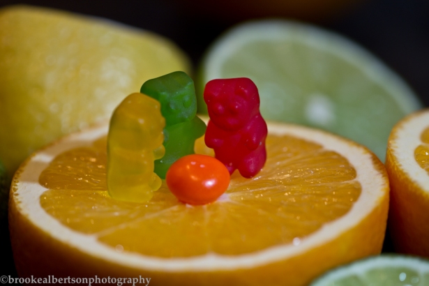
 I like this picture because the gummy bears and the skittle are analogous scheme color and so are the oranges, lemons, and limes. I think that this is a cute picture because the gummy bears are camping around an orange fire! And I like how the background of the picture looks like mountains and since they are camping it works with the picture.I was just having fun with the pictures and thinking of different ideas and bring more to the picture by not just having it of citrus fruits.
 I really like this picture. I think that the green from the limes make the gummy bear pop out more and I think it goes well together. In this picture I think the colors look good. You can tell that the orange is orange and it doesn’t look yellow. I like how the focus is on the gummy bear and part of the orange and I like the range of depth of field.


The last image is the one that stands out as the strongest- best composition, best white balance, best exposure. It is not just a straight shot of something, creative bringing the bear and fruit together. The first couple of lemon/lime images the white balance is off, that can easily be fixed in LR, if you do not know how be sure to ask me and I can show you quickly.
Monochromatic image is good. Varying tones of the green but it is all there and works well.
Nice creative images with the analogous color scheme.